 Torbie
Torbie's own mark, generated rather than exported
Explore this workspace.
Technical background
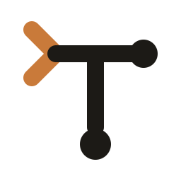
The mark is >T — a prompt closing on the crossbar of a T, whose stem is a git-branch trunk with a commit at its foot and one at the end of the bar. Every asset comes from one definition of that geometry: three SVGs, six Linux PNGs, the Windows .ico, the macOS .icns, five tray images and the docs favicon, eighteen in all. Nothing is hand-exported, so nothing can drift. Two treatments over the one geometry — theme-aware SVGs that flip with prefers-color-scheme, and a bronze duotone that every raster bakes, because a PNG cannot flip and the Windows taskbar takes its colour from the OS rather than from the app. The splash and the accent move onto the same warm-stone palette.
The problem
A fork that has become its own product cannot keep wearing the logo of the project it came from — and an icon set is the classic thing to hand-export once per size and then let drift, so that the 16px tray image and the 512px Linux icon slowly stop being the same mark.
How it works
The mark is >T: a prompt closing on the crossbar of a T, whose stem is a git-branch trunk with a commit at its foot and one at the end of the bar. Its geometry lives in one object in scripts/dev/make-icons.mjs and nowhere else. Every asset is rendered from it — three SVGs, six Linux PNGs, build/windows/icon.ico, build/mac/icon.icns, five tray images and the docs favicon, eighteen files. Nothing is hand-exported, so nothing can drift, and changing the mark means changing one path string and re-running the script.
Try it
node scripts/dev/make-icons.mjs --dry-runto see what would change and by how much.node scripts/dev/make-icons.mjsto write them.
Details
- Two treatments over one geometry. Theme-aware flips ink to cream through
prefers-color-schemeand is what the SVGs ship; bronze duotone is what every raster bakes, because a PNG cannot flip and the Windows taskbar takes its colour fromSystemUsesLightThemerather than from the app. - Rasterized by Chromium, never ImageMagick, which mis-renders SVG strokes — the same reason the jump list draws its icons through a canvas. The rasterizer refuses any size that comes back fully transparent, which is the one failure a set of icons produces silently.
.icoand.icnsare written by hand, because nothing in this stack encodes either. Both are verified by walking the container back: every offset in range, every declared length matching a real PNG of that size, and the ICNS walking to its declared end exactly.- A theme-aware SVG does flip when used as a CSS
background-image— that is how the splash consumes it, and it is the context where an SVG gets no stylesheet from its parent. Measured rather than assumed: the body tone readsrgb(28, 26, 22)in light andrgb(243, 239, 231)in dark, which are the palette's ink and cream exactly. - The splash and the
appearance.accentColordefault move onto the same warm-stone palette in the same pass, so the mark and the interface around it are one set of colours rather than two.
What this does not claim
- macOS is verified structurally and not visually, deliberately. There is no Mac here.
icon.icnsis walked back byte for byte and the tray images are correctly black-plus-alpha — which is what the OS needs to recolour them for the menu bar — but nobody has seen them in Finder, the Dock or the menu bar. Treat them as unchecked, never as checked and fine. app/assets/activity.pngis deliberately untouched: it is the Touch Bar's "this tab has activity" indicator, not a brand asset.